Showing posts with label colour palette 2013. Show all posts

Tuesday, April 9, 2013

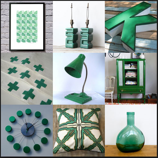
Emerald


Green is the most abundant hue in nature ­the human eye sees more green than any other color in the spectrum, said Leatrice Eiseman, executive director of the Pantone Color Institute. As it has throughout history, multifaceted Emerald continues to sparkle and fascinate. Symbolically, Emerald brings a sense of clarity, renewal and rejuvenation, which is so important in today's complex world. This powerful and universally appealing tone translates easily to both fashion and home interiors

Monday, February 20, 2012

Pop Goes the Colour


So while shopping in Europe, we noticed the introduction of golds, bright pink, greens and blues to accent neutral home decor. Furniture had added piping in brights and rugs had a splash of color. And greys with an accent of gold or green are uptrending this season.


These will not only help brighten up the room and give it a cheerful feel but will also help alleviate the general mood of a fading winter.


When decorating home, major furniture pieces are usually in neutral colors of brown, tan and grey.  Accent these pieces with adding in some pop color. What's more is that Benjamin Moore paint company introduced their 2013 color pallete and while still grounded in neutrals it has great accents of gold, coral and blue.

Benjamin Moore Colour Palette 2013
So go right ahead and create your own pop of colours this season.

Monday, May 16, 2011

The Art of Stacking


The Art of Stacking pervades India, most obviously noticed at fruit vendors, and multiplied into all forms of wares. Particularly fruit: so perishable, and constantly in flux, yet so perfectly stacked, only to be taken down every evening, and re-stacked the next morning.


The colors of the dye in the chemical laboratory of the Rugs by Raj factory. They would make good milkshakes.


Spools of yarn, stacked on shelves.


The permutations and combinations of these colors give rise to fascinating blends.


 Sun, fire, thread, completion.

When stacked together, the sheer abundance, color, weight and scale of these objects seem to lend them an anthropomorphic quality, a sublime beauty in our constructed worlds.

Images and text: Wooly Eyes
Related Posts Plugin for WordPress, Blogger...